
Knowing what I know now, and reviewing what the CDC, NIH, WHO have said in the past, makes it 100% clear cut that they operated to inflict the most pain.
----------------------------------------------------------------------
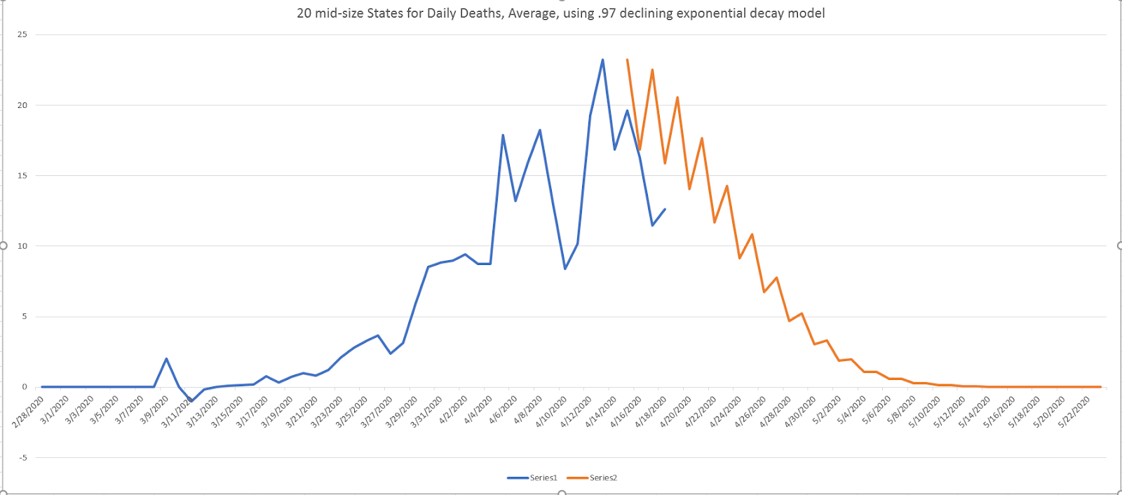
Note the first CHART.....all this hoopla, but in 22 of our states, as a group, they are only averaging 2 deaths a day, Now. A week from now it will be quite a bit less. Wow.
And CHART 2, in the next 20 largest states for deaths, in a week the average will be around 5 per day per state.
See how this is rolling? Heads need to roll. And keep in mind the last little blip, the last little peakiness was created by clear written instruction to count almost every death as
COVID-19. Unprecedented.
They are pimping out a 5 year olds death in Detroit....2 memes.....racism against blacks "hurts them more", and the very young are susceptible.
The smartest thing we could do now is send all schools and colleges back, let the restaurants and bars open and just advise older people to stay away. Young people who live with aging parents or grand parents, say over 70 for sure, should be allowed to not attend school, and shouldn't be allowed to without a signed acknowledgement of warming from the old folks.
After I did the US analysis, I ran Italy also. There is a surprising result there, and I think it is because they have started to loosen up. They have a steady, almost linear decline in death, right after their peak, they did start exponentially going down on a .97, but then as they loosened up, the exponent went to 1.....a linear decline in deaths. They will likely avoid a second wave of any magnitude because "enough" people got it. I put that chart at the far bottom and on it's own page.
...................


After I did the US analysis, I ran Italy also. There is a surprising result there, and I think it is because they have started to loosen up. They have a steady, almost linear decline in death, right after their peak, they did start exponentially going down on a .97, but then as they loosened up, the exponent went to 1.....a linear decline in deaths. They will likely avoid a second wave of any magnitude because "enough" people got it. I put that chart at the far bottom and on it's own page.

No comments:
Post a Comment
Drop a comment here.